ShopDreamUp AI ArtDreamUp

Deviation Actions


Suggested Deviants


Suggested Collections


You Might Like…


Description
medium: digital
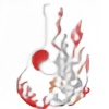
subject: Local Vegetables Trademark
Trademark Owner: Lance Johnson
subject: Local Vegetables Trademark
Trademark Owner: Lance Johnson
Image size
3300x1194px 140.24 KB
© 2009 - 2024 KansasArtist
Comments3
Join the community to add your comment. Already a deviant? Log In
Thank you for the comments. They are what I would call a drive-by critique. Your critique even states "there is your critique", which the you wouldn't have had to say if it was a real critique.
Drive-by critiques are too short and curt to be useful. Sometimes, they are a source of discouragement for artists looking for well-rounded analysis. A critique is more than comments. It's a source of observations and information.
Hopefully, you will only leave critiques when you have time to use the critique form. A complete critique takes careful thought and criticism.
The following is a good short critique which I wrote about this, my own art:
This logo uses two fonts and lines to attempt a pun. The pun and the logo are unclear, however. Primary colors and the use of two non-complimentary fonts are the major weaknesses of this logo.
On the left, the red box outlining the letters LOVE is too close to the blue letters. I obscures the pun and makes it hart to read.
Within the red box are the letters LOVE, spread so far apart as to ruin the effect. These letters are twice the size of the blue letters, which is distracting from their purpose of creating a pun. The layout of these letters is original and unique, which does make it somewhat eye catching.
The use of a blocky font could have been done without the shadow behind the blue letters. It's a small shadow, but does nothing for the design. Instead, the letters could have all been spaced closer to improve legibility.
Primary colors are always ugly when they are the only colors in a logo. Using complimentary colors, or secondary compliments is advisable here.
As a total design concept, it has strong points. However, it needs more attention and work to be a finished logo.
-Lance